Pucker up people!
Well okay, you got me!
That’s not exactly the KISS I wanted to teach you about…

Nope not them either (although that does remind me of a night out at Wembley Arena, London back in 1980, but I digress…)
I’m talking about the K.I.S.S Principle…
(a.k.a. Keep It Simple, Stupid!)
The phrase was first noted by the US Navy in 1960 where they used it as a design principle. The KISS principle states that most systems work best if they are kept simple rather than made complex, therefore simplicity should be a key goal in design and unnecessary complexity should be avoided.
Variations on the phrase include:
- keep it stupid simple,
- keep it short and simple,
- keep it simple, student,
- keep it simple, sir.
- keep it simple or be stupid,
- keep it super simple,
- keep it simple and straightforward, and
- keep it simple, silly.
However, the idea wasn’t a new one, even back in 1960.
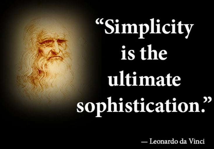
[tweet_dis]Leonardo da Vinci once stated, “Simplicity is the ultimate sophistication!”.[/tweet_dis]

As a concept, it is still very relevant today and something that you should consider when choosing your theme or website design.
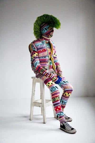
 Purple and green polka dots may be your all-time favourite colour and pattern but they may not look too good on a website.
Similarly, your own personal style may not transfer well online either.
Put yourself in the shoes of your target market and ask yourself, “What would they like to see, design-wise, when visiting my site?”
But simplicity isn’t just about colour choices.
It is also about keeping your website or blog clutter free so that it is pleasing to the eye and so your visitor can find what they want to read in a timely manner.
Put simply…
Simple = Easy on the Eye = Easy To Use = Specific
Clean lines, simple layout, no flashing thingamajigs (including sidebar ads), no videos that autoplay, obvious navigation and no surprises!
Simple doesn’t need to be boring. Good web design can give the user an experience that they will want to repeat.
Good web design can take simple and make it efficient with an easy to use navigation system.
Simple means tidy – no multi-coloured, multi-sized text in 50 different fonts.
A simple design screams confidence.
And we know that confidence is the new sexy, right?
And now we’re back to…
Pucker up people!!!!


