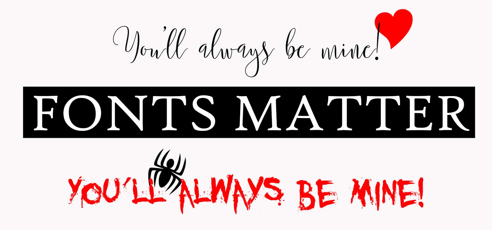
The best way to have a great looking website or blog is to choose the right font.
What’s the best font to use for your blog or website? You may want to have fancy looking fonts and change fonts every other line but the experienced blogger knows, that when it comes to fonts and the web, it is always best to keep it simple.
Not every computer has every font!
 When you choose the font you want, you need to remember that not every computer has every font installed on it. In particular, most people don’t have the fancy fonts installed on their machines. So if you choose one of these fonts for your blog it will not display how you want it to on a machine that doesn’t have that font installed. In fact, it will display the default font instead, which will not give the look you were hoping for and may well drive people away from your blog.
So when writing blog your blog posts and designing your blog themes, keep in mind the availability of fonts when choosing the best font to use for your blog.
So how do we know which fonts most people have?
These fonts are commonly known as ‘web safe fonts’ and you’ll probably find the best font to use for your blog amongst them.
Here is a chart of the 10 most used/installed fonts on the web as of February 25th 2012 [courtesy of Codestyle]
| Font name | Installed (%) |
| Lucida Sans | 100.0% |
| Tahoma | 99.95% |
| Arial | 99.85% |
| Verdana | 99.85% |
| Microsoft Sans Serif | 99.80% |
| Courier New | 99.75% |
| Times New Roman | 99.70% |
| Trebuchet MS | 99.70% |
| Comic Sans MS | 99.46% |
| Georgia | 99.12% |
There’s not a lot of difference between any of the percentages for these fonts so you are fairly safe to use any of the both in the knowledge that they will be installed on the machine your reader is using.
How easy is it to read the font?
Once we have taken a look at the above chart and seen if our chosen font is one that is widely available we next have to consider how easy that font will be to read. In other words, how will it display on a monitor?
These are the four different types (or families) of Web Safe Fonts:
- serif
- sans serif
- fantasy or cursive
- monospace
Serif
Serif fonts are those fonts that have little hooks (or ‘Serifs’) on the end of letters. Some monitors don’t display these little hooks very well and they can become blurred or indistinguishable, particularly if the monitor has a low resolution.
However, these prints are perfect for print so it is safe to use them in any online documents that are intended for downloading and printing.
Some examples of ‘serif’ fonts:
| Bookman Old Style | font-family: ‘Bookman Old Style’, serif; |
| Garamond | font-family: Garamond, serif; |
| Georgia | font-family: Georgia, serif; |
| Palatino Linotype, Book Antiqua | font-family: ‘Palatino Linotype’, ‘Book Antiqua’, Palatino, serif; |
| Times New Roman, Times | font-family: ‘Times New Roman’, Times, serif; |
Sans Serif
Sans Serif fonts do not have the little hooks or serifs on the end of the letters. These will display clearer, crisper and bolder on most monitor resolutions. This makes them easier to read and thus, the perfect choice for your blog.
Some examples of ‘sans serif’ fonts:
| Arial, Helvetica | font-family: Arial, Helvetica, sans-serif; |
| Arial Black, Gadget | font-family: ‘Arial Black’, Gadget, sans-serif; |
| Impact, Charcoal | font-family: Impact, Charcoal, sans-serif; |
| MS Sans Serif, Geneva | font-family: ‘MS Sans Serif’, Geneva, sans-serif; |
| MS Serif, New York | font-family: ‘MS Serif’, ‘New York’, sans-serif; |
| Trebuchet MS, Helvetica | font-family: ‘Trebuchet MS’, Helvetica, sans-serif; |
| Verdana, Geneva | font-family: Verdana, Geneva, sans-serif; |
| Lucida Sans Unicode, Lucida Grande | font-family: ‘Lucida Sans Unicode’, ‘Lucida Grande’, sans-serif; |
| Tahoma, Geneva | font-family: Tahoma, Geneva, sans-serif; |
Fantasy or Cursive
These fonts are not widely available on computers and because they are ‘fancy’ and ‘cursive’ they can be very hard to read in large chunks. If you wish to use these you should restrict them to headings or use them in images.
There is, of course, one exception, Comic Sans MS. This comes in at No. 9 on the list of most widely used and installed fonts and is easy to read and very popular BUT do you really want to use it?
Some example of fantasy or cursive fonts:
| Papyrus | font-family:Papyrus |
| Tempus Sans ITC | font-family: Tempus Sans ITC |
| Lucida Handwriting | font-family: Lucida handwriting, Lucidia sans |
| Monotype Corsiva | font-family: Monotype Corsiva |
| French Script MT | font-family: French Script MT |
| Goudy Stout | font-family: Goudy Stout |
| Script MT Bold | font-family: Script MT Bold |
| Comic Sans MS | font-family: ‘Comic Sans MS’, cursive; |
Monospace
Most webmasters and developers use mono-space for code samples or instructions.
It is as the name suggests, a font that has it’s letters evenly spaced. Monospace letters have the same width for each character, so they always take up the same amount of space, like a typewriter.
It is sometimes referred to as typewriter text. It’s not the most exciting font to use on your blog.
Some examples of monospace fonts:
| Courier | font-family: Courier, monospace; |
| Courier New, Courier | font-family: ‘Courier New’, Courier, monospace; |
| Lucida Console, Monaco | font-family: ‘Lucida Console’, Monaco, monospace; |
What size font should I choose?
This is definitely up for discussion. Many people believe that 16 pixels should be the ideal font size. Personally, I think a font size of 14 pixels is perfectly big enough. If you are writing a blog specifically for a target audience that may have issues with reading a smaller print then, knock yourself out, and use 16 pixels or bigger, otherwise I think you are safe with 14 pixels. But just be aware that different fonts look different sizes sometimes with the same font size.
So what’s the best font to use for your blog?
It’s an important decision and you should weigh up your personal choice with the following rules to help you choose the best font to use for your blog:
- Sans serif for online, Serif for print (or downloadable documents intended for printing)
- Keep fancy fonts to a minimum and limit to headings and accents.
- Don’t use more than 2-3 fonts on any one page.
- Don’t change fonts in the middle of a sentence without a very good reason.
- Monospace for typewriter and code
- Script and Fantasy for accents only.
Do you have a favourite font or preferred font size? – If so, please leave a comment below. I’d love to know what you think.


