Even when armed with the best website design solution, it’s not always easy coming up with a website that feels cutting edge.
Following current web design trends is absolutely critical if you hope to create a site that’ll impress visitors.
That’s why we’ve asked our friends at Elementor, one of the most popular website builders out there, to share the top five prevailing web design trends you should consider in 2021.
So, without further ado, let’s get to them!
1. Collage Art
Like with many other UI trends, Collage art initially rose to popularity on social media.
A go-to format for Stories and news feed content, collages’ ability to stimulate was soon discovered by web designers.
Web-design collage art will typically encompass a number of core elements:Most collages will sprawl out across a full-width visual. They will include a precise cut-out of an image (usually a photograph), as well. These elements will all be integrated using a mix of solid color graphics and patterned illustrations.
Sounds a bit confusing.
We know:)
But it makes total sense once you see it in action:
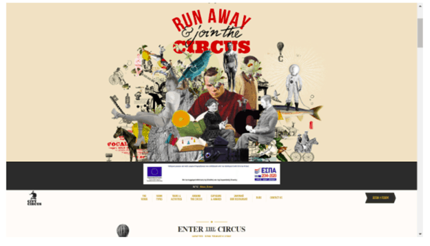
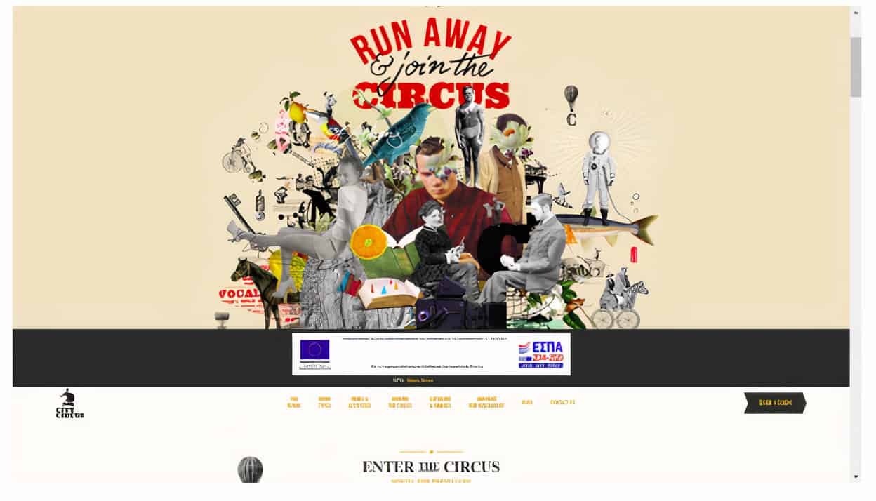
The City Circus, an Athens hostel, created a collage and set it as its homepage’s centerpiece. Incorporating images and art related to the historical area in which it is located, The City Circus has one of the most striking hostel websites you’ll ever see.
2. Analogous colours
Even when they’re not exactly from the same palette family, certain coloor schemes simply fit together. Coloor groupings such as these are called analogous coloors.
When blended together within a website, these colours contribute to a harmonious scheme; the kind that a casual viewer will almost certainly find eye-catching.
In a more technical sense, analogous colours are composed of three different hues:
A dominant coloor (typically a primary coloor), a complementary coloor (or secondary coloor), and a third and final coloor. The latter will either be a sort of blend of the first two coloors, or, alternatively, it will be a more of a ‘curveball’ hue that makes the scheme stick out.
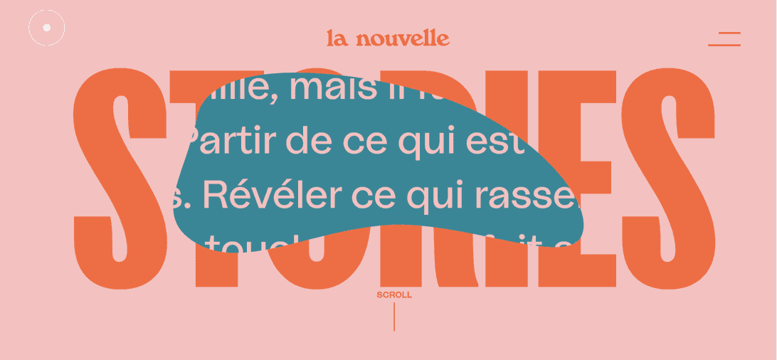
La nouvelle seems to pull off the impossible; elegantly combining somewhat bland (and frankly unappealing) colors in a way that immediately catches the eye. The darker pink background enables the more dominant orange block font to shine. And, when the darker turquoise is revealed when scrolling down, the overall aesthetic simply works.
3. 90s pixelated design
80’s nostalgia dominated much of the previous decade. A flurry of movies and television shows were either set during that decade (think Stranger Things) or were actually aired during that decade and were reinvented for a new audience (think Fuller House and Nightmare on Elm’s St.). It seemed that Zoomers suddenly had insatiable appetites for 80’s-themed entertainment. Well, believe it or not, the 90s are now officially retro, too.
The decade in which video games truly rose to dominate popular culture, the 90’s aesthetic is very much defined by the most popular arcade games of that era.
Those looking to truly capture the spirit of what now feels like a faraway decade, should strive to fuse simplistic pixelated graphics with a more dynamic 3D style of presentation.
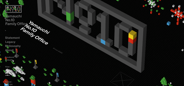
The website on display is a perfect representation of this dual approach.
Those who land on this site are immediately drawn to the block graphic motif, sophisticatedly presented in slick 3D. The background shifting when scrolling up and down is a nice touch, as well.
4. Negative colours
2021 saw designers and web design agencies gravitate towards very bold colours, specifically primary ones:
Red, blue and yellow.
Using them effectively often entails combining multiple deeply contrasting primary colours, akin to comics-like themes and 90’s-style motifs. These types of colour combinations often target younger audiences; their upbeat, exciting vibe resonating with less mature unique aesthetic sensibilities.
Check this out:
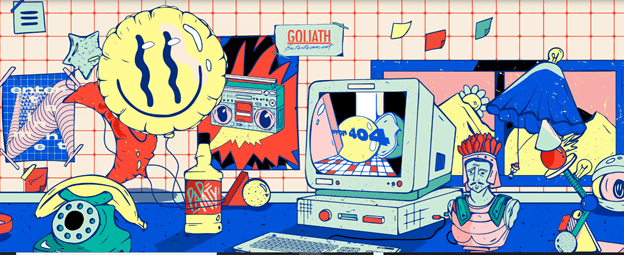
Goliath Entertainment’s home page is a perfect representation of negative color combinations done right. The rotary telephones, boomboxes, and other iconic 90’s items will resonate strongly with Millennials who grew up in that decade.
5. Black outline
Black illustrations have become fan favorites among web designers. Enamored with their sleek, striking aesthetic, web designers leverage this dark graphic approach in other areas. A prime example is black outlines around different elements throughout their website. These black lines and borders can vary in thicknesses; they’re often used as page dividers, specifically as grid boxes of numerous sizes.
The following example is unique in that it combines said black lines and illustrations with real photographed images.
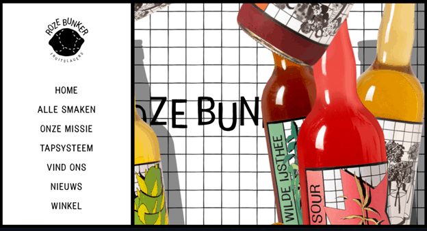
The black borders and accents have a powerful impact on user engagement. This type of graphic design catches visitors’ attention instantly. The latter will find themselves drawn to the messaging and experiences the designer seeks to relay.
Final thoughts and takeaways
With less than 4 months until the end of the year, web designers have their work cut out for them if they hope to stand out in 2021.
Adopting these design trends will help stimulate visitors, and enable your website to truly leave a mark.
We wish you guys good luck in implementing them!
About the author
Yoni Yampolsky is a marketing manager at Elementor. The most popular WordPress website builder Elementor powers more than 5% of all the world’s websites.
